Principles of Digital Image Synthesis
So one of the things I'm doing this summer is reading Principles of Digital Image Synthesis by Andrew Glassner. It's from 1995 which makes it almost 20 years old, but the fundamental mathematics don't change and it's quite comprehensive. I found it released freely here
It starts with "The Human Visual System and Color" for the first 100ish pages, covering "The Human Visual System", "Color Spaces", and "Displays". While I thought the chapter on how the eye works was interesting, I didn't really pay close attention to it, so that I feel like while I have a better understanding of how eyesight works than before, I don't think I could really explain it to someone else.
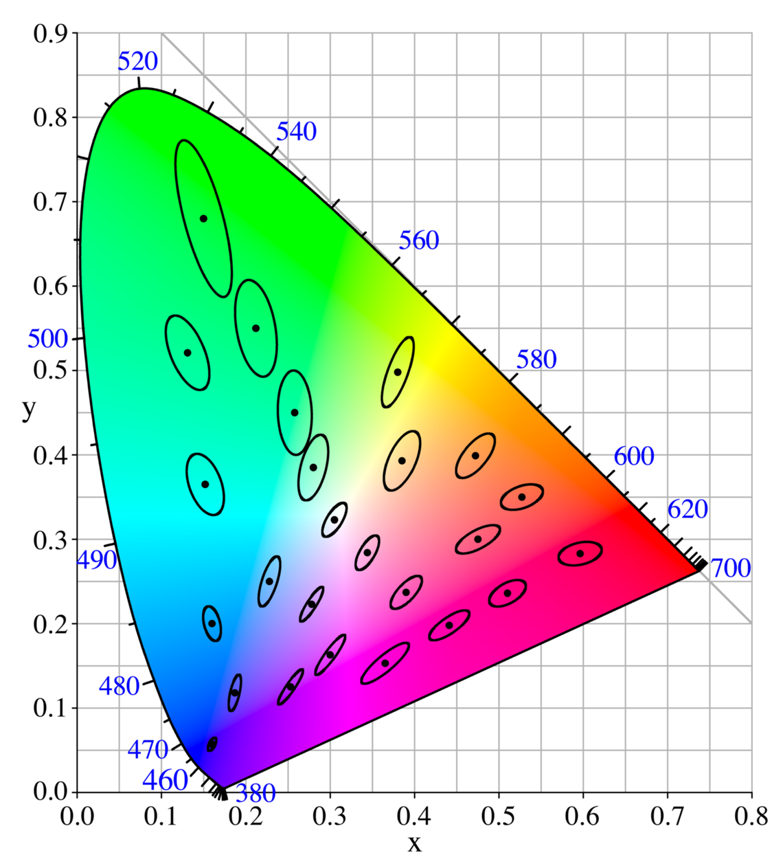
Color spaces was too abstract for something that I thought should have been more visceral considering that it's color, but I think the main point of the chapter is that saying "it's just color, how difficult can it be?" is a very big mistake. There are problems with how a human perceives color, the unintuitiveness of the CIE XYZ color space, and more importantly the gamut that your monitor or printer is able to render. The chapter on color spaces also talks about the problem of perceptual uniformity; that is, in the XYZ color space, changes of equal distance are not equally perceptible.

The ellipses shown were reported to be of constant color in an experiment, and they may or may not on your computer because the ellipses are enlarged and your computer may display the colors differently, so that there is a perceivable difference.
This is the part where I sort of stopped trying to understand 100% of what was going on. To fix this problem of perceptual (non-)uniformity, the CIE defined other spaces, L*a*b and L*u*v, which are transformations of the XYZ color space. I understand that the point is to make the spaces perceptually linear, but I don't really see what the formulas are doing or have any intuition for them other than the description that you can imagine a cylinder with the vertical axis being lightness and the angle and distance from the center being hue and saturation or whatever. Maybe if the pictures in the pdf were in color they would make sense. We actually have a copy of the book in the libraries at Rutgers; I should really just check the first volume out or something.
The chapter on Displays was interesting but mostly about CRTs, which, obviously, aren't used very much after 20 years, so I don't really have much to say about it. There was material about the RGB color space and gamut mapping but I feel like I don't need to understand that 100% right now so I will continue on.
I wrote surprisingly more than I thought I would for what amounts to a summary of a cursory reading of the (if I may) more boring parts of a textbook.